NASA captured 20 years of changing seasons in a striking new global map of the home planet.
The data visualization, released this week, shows Earth's fluctuations as seen from space.
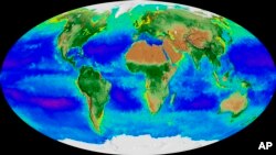
The polar ice caps and snow cover are shown ebbing and flowing with the seasons. The varying ocean shades of blue, green, red and purple depict the abundance — or lack — of undersea life.
"It's like watching the Earth breathe. It's really remarkable," said NASA oceanographer Jeremy Werdell, who took part in the project.
Two decades — from September 1997 to this past September — are crunched into 2½ minutes of viewing.
Werdell finds the imagery mesmerizing. "It's like all of my senses are being transported into space, and then you can compress time and rewind it, and just continually watch this kind of visualization," he said Friday.
Werdell said the visualization shows spring coming earlier and autumn lasting longer in the Northern Hemisphere. Also noticeable to him is the receding of the Arctic ice caps over time — and, though less obvious, the Antarctic, too.
On the sea side, Werdell was struck by "this hugely productive bloom of biology" that exploded in the Pacific along the equator from 1997 to 1998 — when a water-warming El Nino merged into cooling La Nina. This algae bloom is evident by a line of bright green.
In considerably smaller Lake Erie, more and more contaminating algae blooms are apparent — appearing red and yellow.
All this data can provide resources for policymakers as well as commercial fishermen and many others, according to Werdell.
Programmer Alex Kekesi of NASA's Goddard Space Flight Center in Maryland said it took three months to complete the visualization, using satellite imagery.
Just like our Earth, the visualization will continually change, officials said, as computer systems improve, new remote-sensing satellites are launched and more observations are made.